
In the ever-evolving landscape of healthcare, technology’s role in equipping agents has become paramount. United Healthcare’s Jarvis portal emerged as a beacon for agents, being warmly embraced by its community.
Yet even the brightest beacons sometimes fade in comparison to newer lights. As Jarvis began to show signs of trailing behind competitors, it unearthed an opportunity – not just to catch up, but to leap ahead.
This case study delves deep into the subtle misalignments between Jarvis’s offerings and its users’ rhythms, revealing the challenges and the potential within. The journey of reimagining Jarvis wasn’t just about adding new features, but a voyage to synchronize technology with human needs, rhythms, and desires.

UnitedHealthcare (UHC) is a major health insurance provider in the United States, focusing on improving accessibility and affordability in healthcare. Serving millions of individuals, employers, and governmental programs, UHC aims to simplify the healthcare experience, providing diverse solutions tailored to meet various needs. Its substantial influence makes it a key player in the nation’s healthcare industry.
Jarvis Agent Assistant, is a suite of tools that help Medicare Benefit Agents acquire new clients, support existing members, and grow their business.
-
- Jarvis is a proprietary portal that helps UnitedHealthcare agents sell supplemental Medicare
- It is designed to equip agents with essential tools and information, including enrollment processes and product knowledge.
- Jarvis serves as a pivotal tool for agents, facilitating various aspects from enrollment to product knowledge.
Initial Problems Identified
-
- Jarvis was not as adaptive, and user centered as competitor portals.
- It struggled to align with the daily workflows of agents, causing inefficiencies and dissatisfaction.
- A gap was identified in its ability to facilitate a seamless and intuitive user experience.
Project Goals
-
- Enhanced User Experience:
Revitalize Jarvis to be more intuitive, adaptive, and aligned with user workflows, fostering improved satisfaction and usability. - Competitive Improvement
Elevate Jarvis to meet or surpass competitor standards in functionality and user-centric design, positioning it as a leading agent portal. - Operational Efficacy and Education
Promote a well-organized information hierarchy, smoother design transitions, and foundational UX education to ensure seamless adaptation and improved operational efficiency.
- Enhanced User Experience:
Measurements for Success
-
- Jarvis was not as adaptive, and user centered as competitor portals.
- It struggled to align with the daily workflows of agents, causing inefficiencies and dissatisfaction.
- A gap was identified in its ability to facilitate a seamless and intuitive user experience.
Constraints
-
- Duration:
One year - Collaborators:
2 Direct UX reports, 8-10 developers (including international time zones), project managers, agents, their clients, upper management, and reoccurring visual presentations to c-level executives. - Constraints:
Accessibility compliance, must adhere to existing design system, will be built on the Adobe Experience Manager (AEM) platform, must be fully responsive and design must be easily translated into a headless JS architecture.
- Duration:
Objective
Uncover Jarvis’ functionality, understand daily agent operations, highlight client conversion bottlenecks, and devise a rejuvenated design and information architecture.
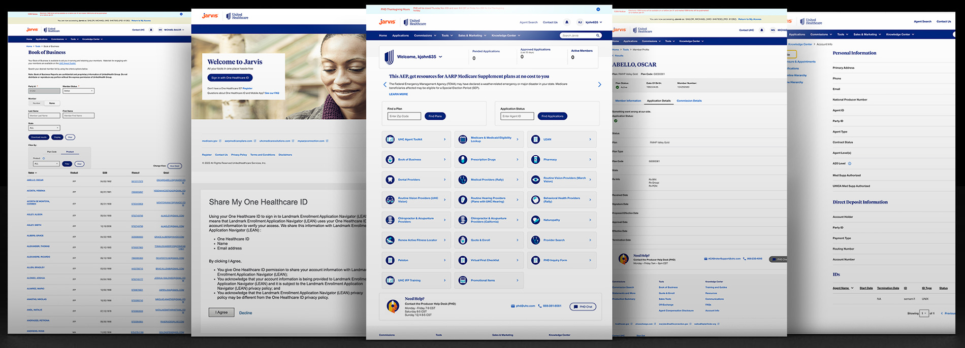
At the outset of the heuristic evaluation, our team embarked on a detailed assessment to gauge its current usability and design effectiveness. This initial phase focused on identifying key areas where Jarvis’s user interface and experience could be improved, paying close attention to navigation, content organization, and overall ease of use.
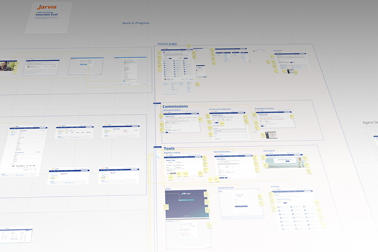
Through this process, we aimed to pinpoint specific issues that hindered the portal’s functionality and user satisfaction, laying the groundwork for targeted improvements.
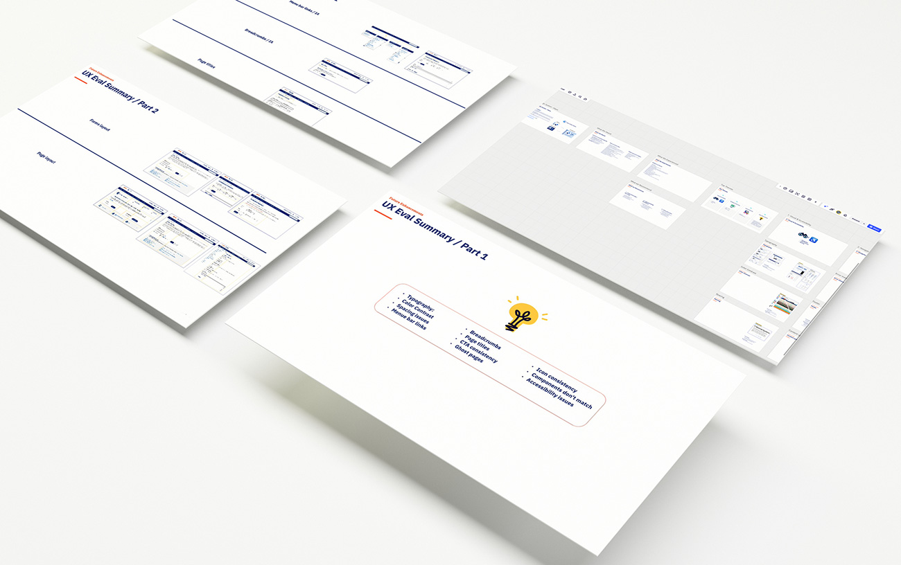
Upon completing the heuristic evaluation of the Jarvis portal, we uncovered several critical findings. Key issues identified included a lack of intuitive navigation, inconsistent content organization, and areas where the user interface did not align with best practices for usability.
Additionally, we found that the portal’s design was not optimally tailored to the unique workflows of the agents, impacting their efficiency and overall experience.
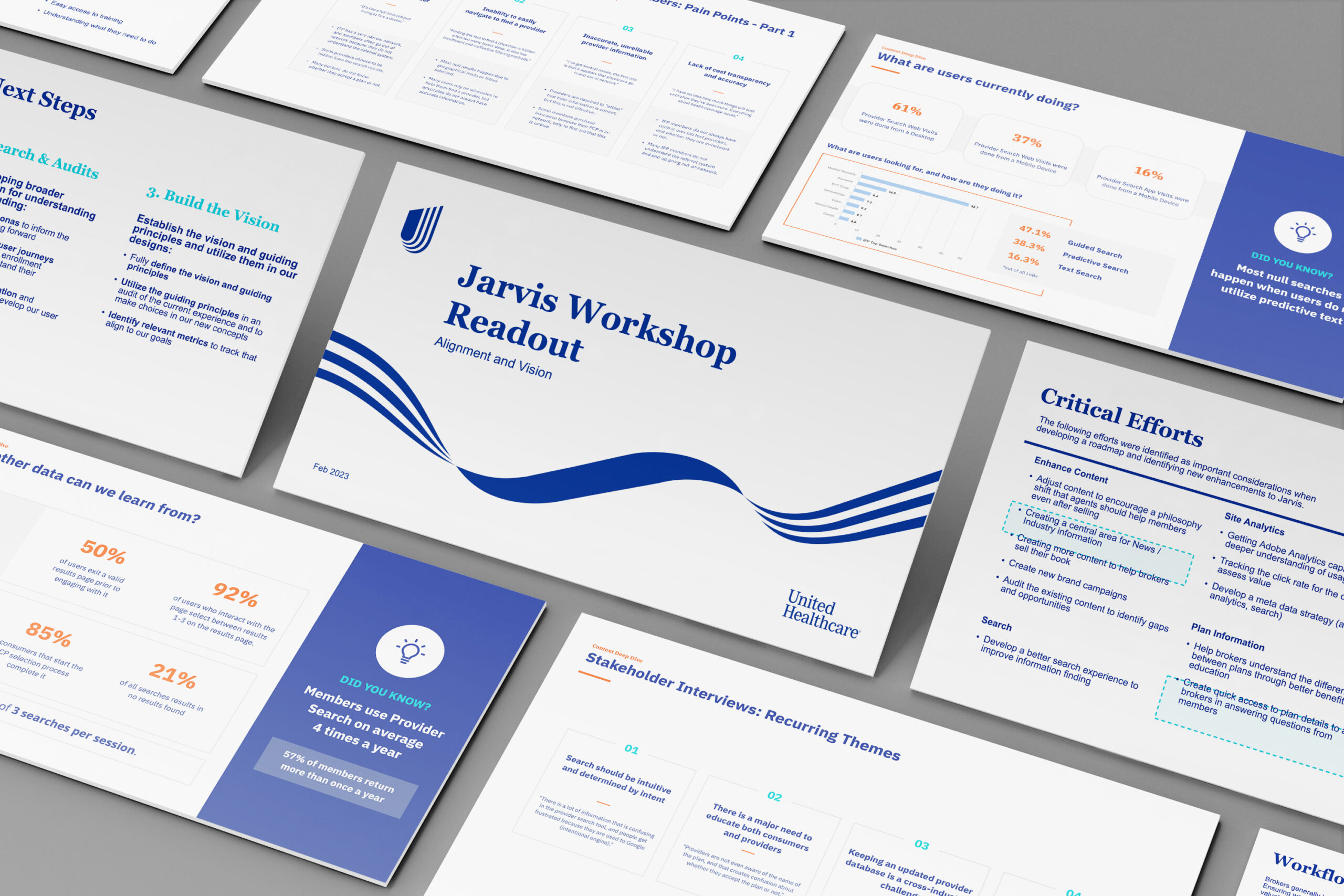
These insights were meticulously compiled into a comprehensive presentation deck, designed to clearly communicate our findings. This deck was then shared with stakeholders and executives at UnitedHealthcare, providing them with a detailed overview of the existing challenges and setting the stage for the subsequent phases of the redesign process.
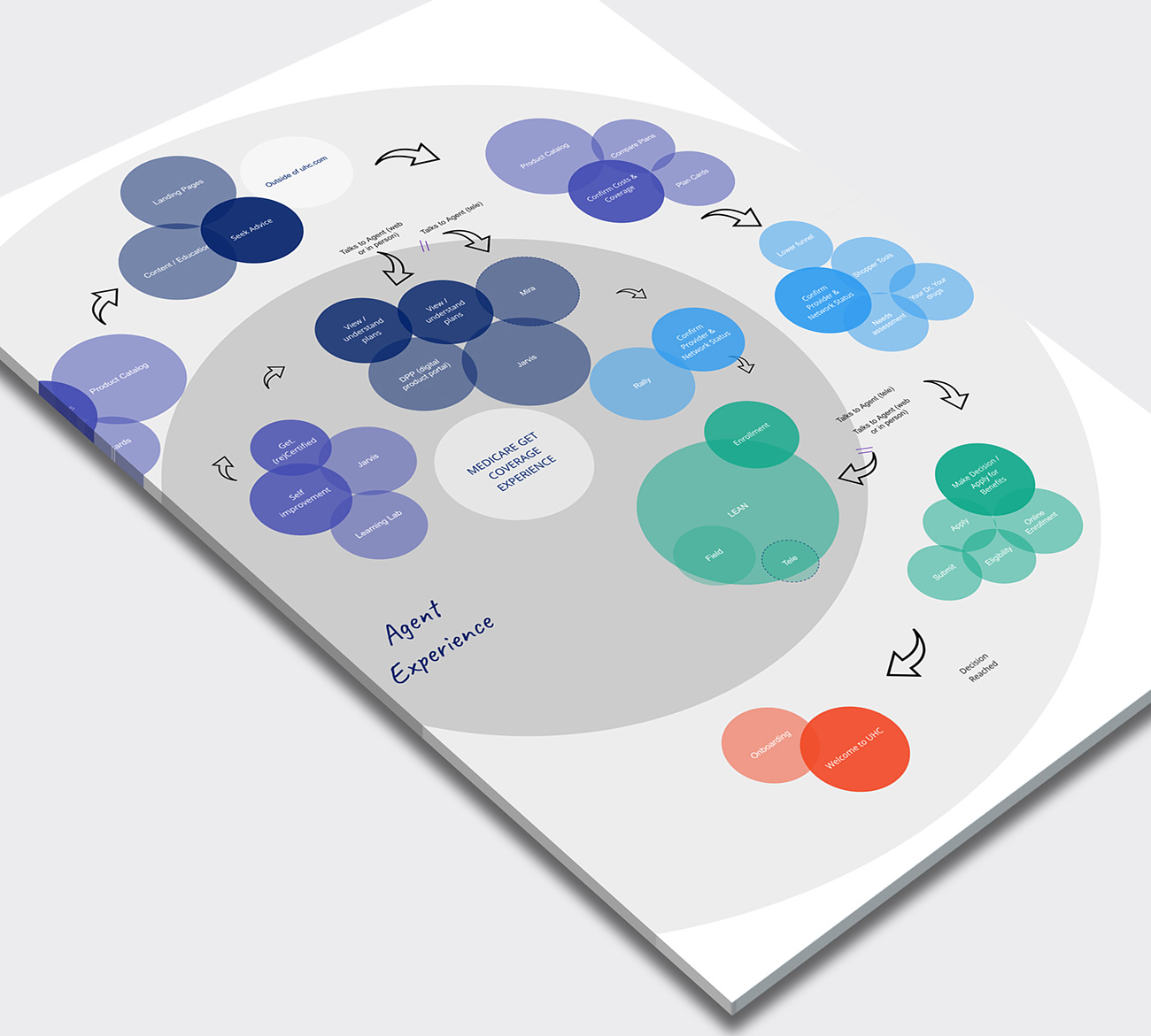
In the next phase of our case study, we developed an ecosystem map based on our heuristic evaluation findings to detail the full experience of an agent interacting with the Jarvis portal. This map provided a comprehensive view of the agents’ journey, outlining each touchpoint where they engaged with Jarvis, from initial login to completing specific tasks. It highlighted the agents’ actions, thoughts, and pain points throughout their interactions, offering valuable insights into their overall experience.
By visualizing the agents’ journey in this way, we were able to identify key moments that required optimization and areas where the user experience could be significantly enhanced. This ecosystem mapping served as a critical tool in understanding and addressing the complexities of the agents’ interactions with Jarvis, guiding our design strategy towards more user-centric solutions.

I created a member acquisition workflow map, drawing from insights gleaned in the heuristic evaluation of the Jarvis portal. This map concisely illustrated the step-by-step process agents undergo when acquiring new members, highlighting critical interaction points and potential bottlenecks.
It served as an instrumental guide in pinpointing areas for improvement, thereby enhancing the efficiency and effectiveness of the member acquisition journey within Jarvis.
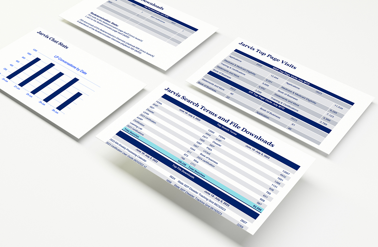
During the “Benchmarking” phase of our project, we focused on gathering extensive analytic data to establish a comprehensive baseline for the current state of the Jarvis portal. This involved collecting detailed metrics on user engagement, task completion times, and error rates, among other key performance indicators.
The objective was to create a solid foundation of quantifiable data, enabling us to measure the impact of future changes accurately and objectively. This benchmarking process was crucial in setting clear, data-driven goals for the redesign and ensuring that any modifications to Jarvis could be evaluated against these established metrics for tangible improvements.

In the interview phase of our project, we engaged in direct conversations with a diverse group of over 35 individuals, encompassing both subject matter experts on the Jarvis system and the end-users, the agents themselves.
This phase was critical for acquiring verified, firsthand feedback on the nuances of Jarvis’s functionality and its day-to-day use. By speaking with those who create and maintain the portal, as well as those who rely on it for their work, we gained a multifaceted understanding of the system’s strengths and areas needing improvement. These interviews offered invaluable insights into user requirements, preferences, and challenges, providing a rich, qualitative complement to our quantitative data.
The collected feedback became a cornerstone for the iterative design process, ensuring that subsequent enhancements were grounded in actual user experiences and expert knowledge.
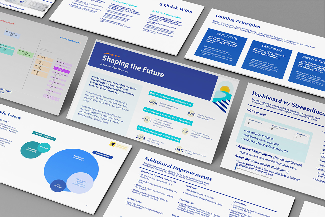
In the subsequent phase of our process, we synthesized our key findings into a presentation deck designed for clarity and impact, tailored for UnitedHealthcare’s stakeholders and executives. The deck highlighted three distinct agent workflows within Jarvis: Assisting the agent, Preparing for a sale, and Personal growth, each with unique needs and interaction patterns.
We also delineated two distinct content types: transactional, which agents accessed frequently but for short durations, and informational, where agents spent more time digesting content. This classification revealed the critical balance Jarvis needed to strike between providing quick-access tools and in-depth resources.
By presenting these findings, we aimed to align stakeholders on the current user experience and set the stage for targeted design interventions that would address these specific workflow and content engagement insights.
Summary
-
- 3 Distinct Agent Workflows
Assisting the agent, Preparing for a sale, and Personal growth.
- 3 Distinct Agent Workflows
-
- 2 Distinct Content Types
Agents briefly interact with transactional content but immerse themselves in informational content.
- 2 Distinct Content Types
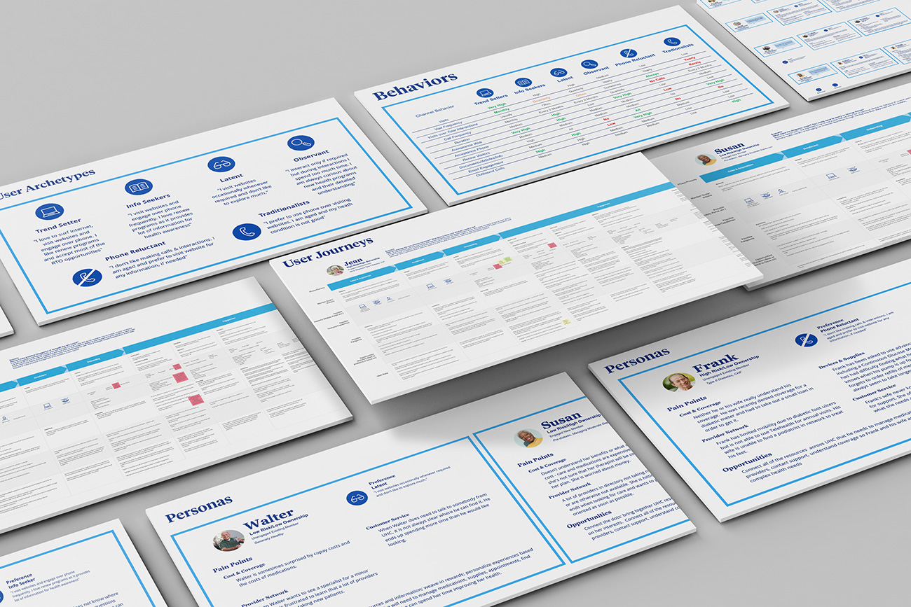
Building upon our findings, the creation of detailed personas and user journeys was the next critical step. Personas were crafted to represent the diverse spectrum of Jarvis users, embodying their behaviors, goals, and challenges to inform our design strategy.
These personas then guided the construction of user journey maps, which visualized the step-by-step experiences of agents interacting with Jarvis, from initial log-in to the completion of various tasks. These journeys illuminated the touchpoints where Jarvis could better support its users, highlighting opportunities for enhancing the agent experience.
By grounding our design decisions in these personas and journeys, we ensured that our redesign efforts would be empathetic to the real and varied needs of UnitedHealthcare’s agents.
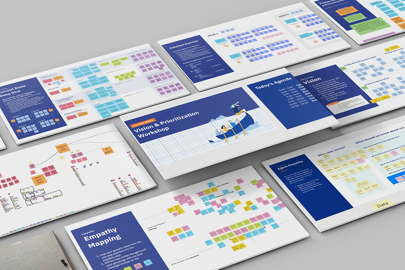
During this phase, we transitioned into an interactive group workshop, utilizing the virtual collaborative workspace provided by Miro to dissect and delve into the problems and opportunities we had unearthed. This online session gathered key stakeholders from various departments, all engaging in the critical analysis of the personas and user journeys we had developed.
Through the Miro platform, team members were able to dynamically contribute, categorize, and visualize issues and ideas, ensuring a comprehensive examination of the user experience. The virtual workshop format allowed for a high degree of participation and creativity, breaking down geographical and hierarchical barriers. As a result, we generated a wealth of insights and perspectives that laid the groundwork for the next steps in our design process.
The workshop’s outcomes were instrumental in crystallizing the key challenges faced by the Jarvis portal. We pinpointed a neglected content strategy that had led to disarray, a notable absence of notifications for critical updates, and a prevalence of inadequate content imagery and explanations.
The homepage was also found to be excessively sales-oriented, neglecting the wider needs of agents, and the search for informational content was hampered by poor site navigation. These deficiencies were not just usability concerns; they were directly contributing to an uptick in agent turnover, with many transitioning to competitors like Aetna and Humana for a more cohesive experience.
To convey these issues effectively to decision-makers, we synthesized the findings into a clear, concise presentation deck, which was then shared with UnitedHealthcare’s executives, ensuring the workshop’s insights would be actionable at the highest level of strategy planning.
Challenges Identified:
-
- Abandoned content strategy.
- Lack of agent notifications on updates.
- Poor content imagery and explanations.
- Homepage’s narrow focus on sales.
- Difficulties in locating informational content.
Impact:
-
- Elevated agent attrition towards competitors like Aetna and Humana.
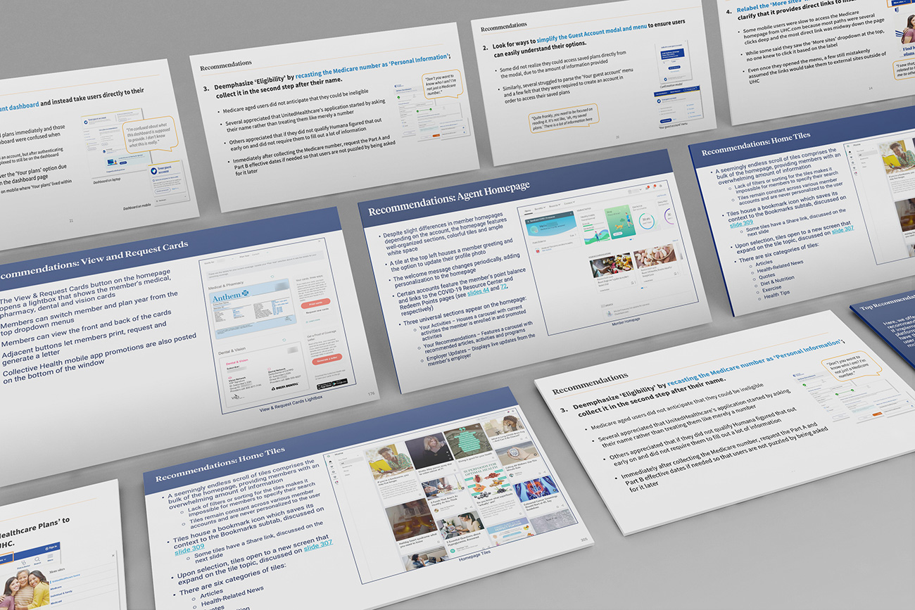
During our intensive multi-day workshops, we pooled together insights from a wide array of stakeholders to form a cohesive picture of the Jarvis portal’s user experience. This collaborative effort led to the creation of a detailed presentation deck that not only highlighted the existing challenges but also proposed actionable solutions.
One of the deck’s key objectives was to showcase a series of mockups, ranging from low to high fidelity, each representing potential improvements to the portal’s interface and functionality. These visual mockups were crucial in helping stakeholders visualize the tangible changes that could enhance the agent experience.
The recommendation deck, thus, served as a strategic blueprint for the envisioned evolution of Jarvis, aligning the team on the design direction and setting the stage for the development phase.
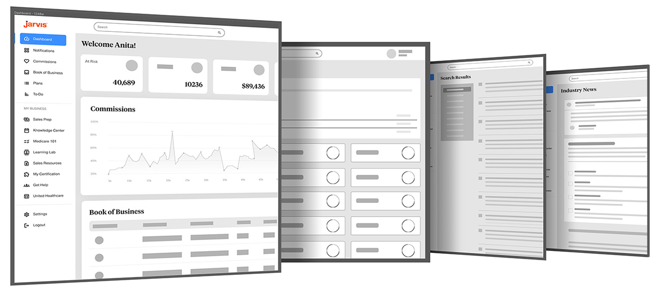
The prototyping phase marked a significant step forward in the Jarvis portal’s redesign, where the approved proposals began to take tangible form. Employing a suite of tools such as Miro for collaborative ideation, Figma for interactive prototyping, and Adobe Creative Suite for refined visual assets, our team developed a series of prototypes.
These ranged from initial low-fidelity sketches that captured the core concepts, to high-fidelity models that provided a realistic preview of the proposed changes. Through an iterative process fueled by ongoing feedback loops, each prototype was meticulously refined.
This ensured that the final designs not only aligned with the stakeholders’ vision but also addressed the user feedback that had been so critical to our research phase.
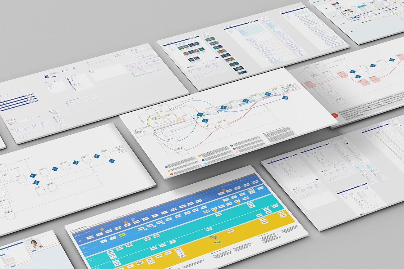
During the prototyping phase, a crucial task was to map out role-based permissions, ensuring a personalized and relevant experience for each agent. We meticulously defined the access levels and content visibility for different agent roles, recognizing that a one-size-fits-all approach was not sufficient.
Using conditional logic in our prototypes, we demonstrated how the portal’s content and tools would dynamically adapt to the permissions associated with the logged-in agent’s profile. This customization was critical in making the portal not only more secure but also more intuitive, as agents could now navigate with an interface tailored to their specific needs and tasks.
The prototypes, therefore, served as a blueprint for a more efficient and user-centric Jarvis, showcasing a system where information architecture and user permissions worked in harmony to enhance the user experience.
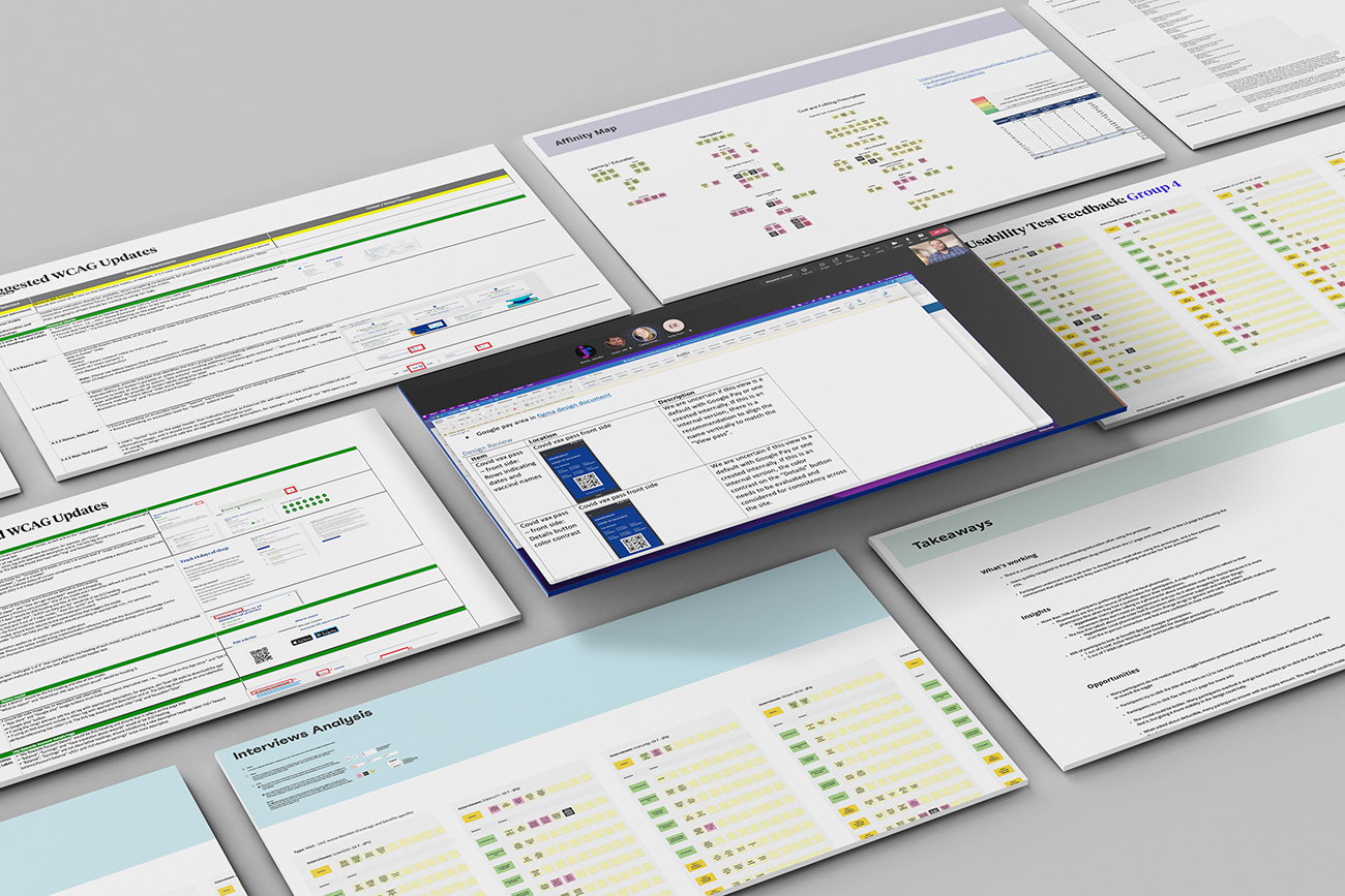
WCAG Compliance
As we progressed into the accessibility phase of our design process, adherence to the Web Content Accessibility Guidelines (WCAG) became paramount. This involved a meticulous review of our prototypes to ensure they met the rigorous standards for accessibility, allowing users of all abilities to navigate Jarvis with ease.
We incorporated contrast checks, keyboard navigation simulations, and screen reader compatibility tests to create an inclusive user environment. Training sessions with the design team were also implemented, focusing on the principles of accessible design to ensure sustained compliance and awareness.
Ultimately, these efforts ensured that our redesigned Jarvis portal would not only be more user-friendly but also universally accessible, demonstrating UnitedHealthcare’s commitment to serving a diverse agent population.
Usability Testing
In the critical phase of usability testing, we engaged with a broad participant base of over 60 individuals, including end-users (agents), their clients (members), subject matter experts, and stakeholders. The objective was to dig deeper into the user feedback we had received, resolve any conflicts, and critically assess our proposed design changes.
A variety of methods were employed: one-on-one interviews provided detailed insights, card sorting helped us understand user mental models, focus groups facilitated discussions on user preferences, and additional tools were utilized to gather comprehensive feedback. Throughout the process, it was evident that while the design improvements were well-received, there was a significant concern over the lack of communication regarding the implementation of these changes.
This feedback was invaluable, as it not only highlighted the designs’ strengths but also underscored the need for a more transparent change management process. The results from this phase were integral in refining the final design, ensuring that the transition to the new system would be as smooth and user-friendly as possible.
Methods:
- Interviews,
- card sorts,
- focus groups,
- and more.
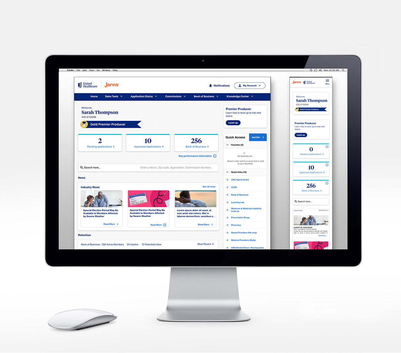
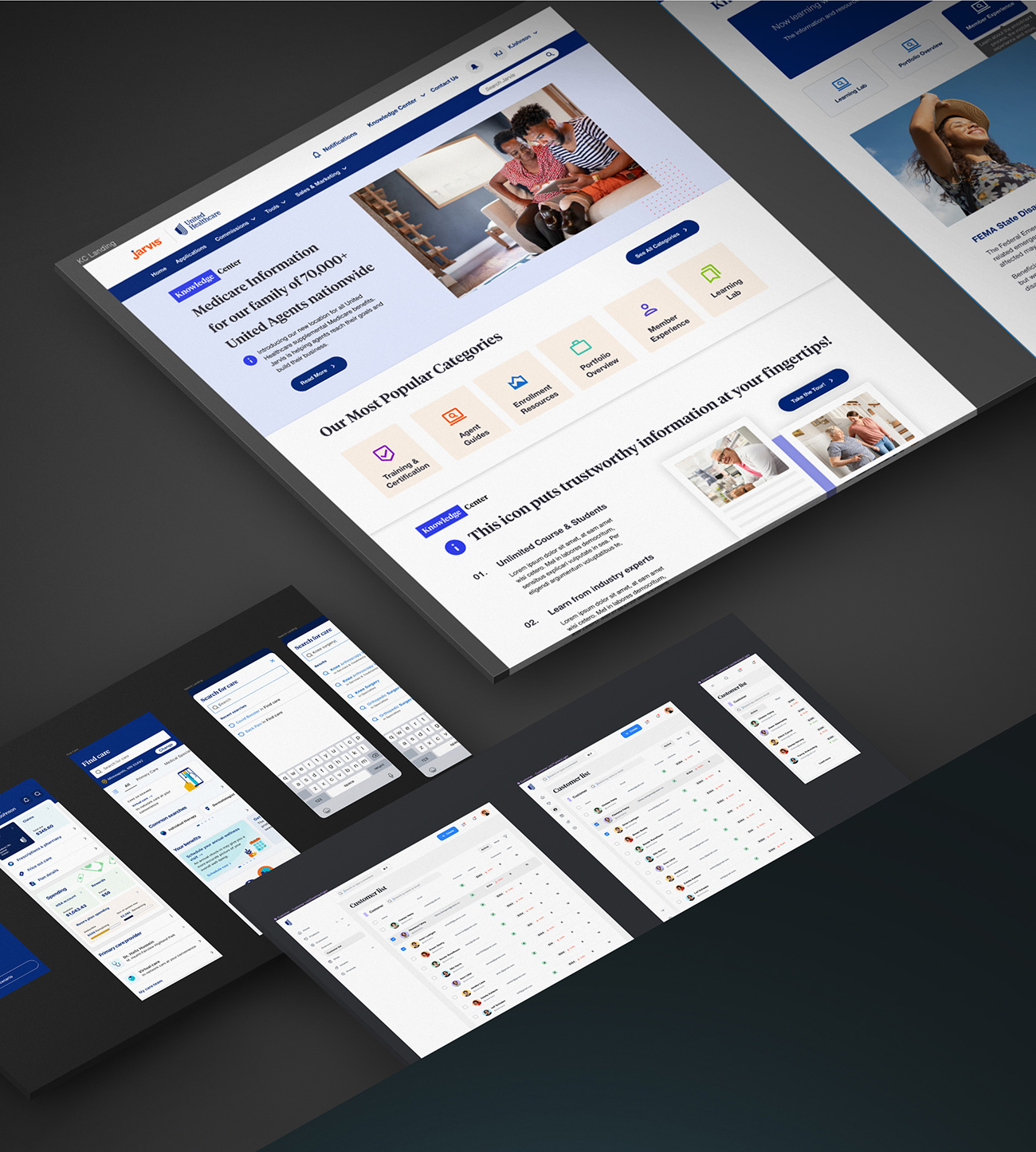
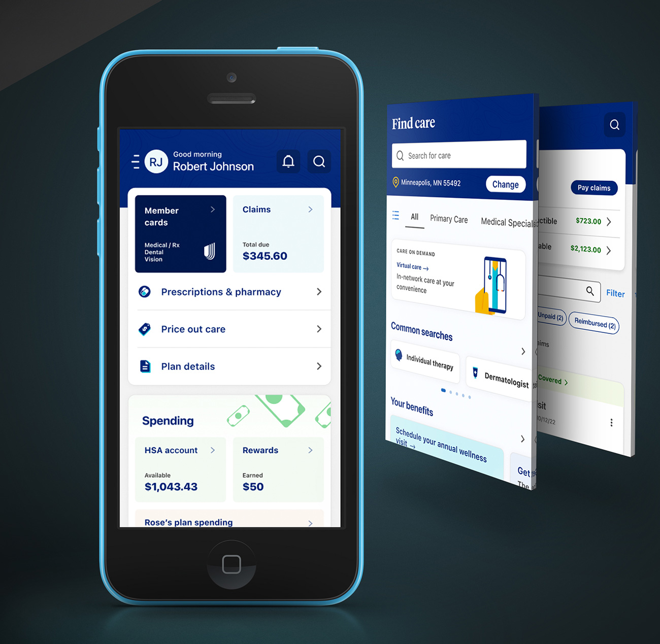
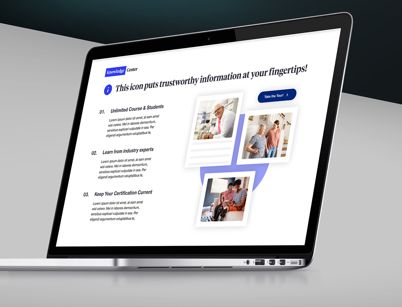
Armed with comprehensive feedback and a deep understanding of user needs, we forged ahead to create the final design of the Jarvis portal. Utilizing tools like Figma and Sketch, along with the ‘Abyss’ design system, we were able to construct a reimagined interface that prioritized accessibility and ease of use.
The new design was rigorously optimized for mobile compatibility, ensuring that agents could access the portal with the same efficiency on-the-go as they could from their desktops. This culminated in a Jarvis portal that was not just a tool, but a seamlessly integrated part of the agents’ daily workflow, adaptable across devices and accessible to all users.
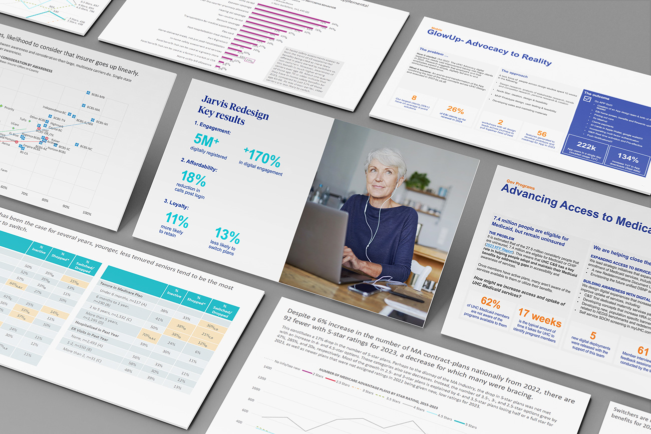
Once the redesigned Jarvis portal went live, the impact was immediate and measurable. Agent engagement soared to an impressive 82%, indicating that the new design resonated well with the users and their day-to-day activities. Even more telling was the 80% surge in the findability of content, streamlining agents’ workflows and reducing the time spent searching for information. This significant improvement in content accessibility highlighted the success of our information architecture overhaul.
Throughout the project, one key insight stood out: the power of a thorough process map to reveal underlying challenges that may not be immediately apparent. It was this insight that drove our design decisions and led to the notable outcomes we observed.
Looking ahead, we’ve pinpointed essential next steps to further enhance the user experience. These include the integration of detailed user guides and proactive user training to ensure agents can fully leverage the portal’s capabilities from the outset. Additionally, plans are in place to refine design transitions even further, ensuring that any future changes are introduced in a way that feels natural and is easily adopted by the agents. These initiatives are expected to build on the current success and continue to elevate the usability and functionality of the Jarvis portal.
The journey of Jarvis is a testament to the transformative power of user-centric design in the healthcare domain. What started as a recognized gap in functionality and design quickly turned into a canvas brimming with opportunities.
This case study illustrates the importance of not just keeping pace with industry standards but setting them.